 Who is the only person featured on both sides of a coin? Give up?
  Well I didn't intend for this to be a serious quiz--not with the pictures to the right. Obviously any American readers will know that President Abraham Lincoln is on the front of the current penny (and if you don't know something so basic as that you should be shot, or at least have something really bad happen to you...:-P) You can see it easily on this picture, perhaps a bit easier than on an actual coin (especially if you don't have great eyesight) but Lincoln is also featured on the back. The Lincoln memorial in D.C. is on the back of the penny and the memorial includes a large statue of Lincoln in the center--you can just see this statue on the penny design.
Thus Lincoln is the only person on both sides of a coin--to this point. Later this year it will all change with the South Dakota quarter. And I have a preview of the design right here for your viewing pleasure. Of course George Washington is on the front of the quarter (again if you don't know that and you're American submit yourself for punishment somewhere suitable) and as his visage is featured in Mount Rushmore, South Dakota's most famous landmark--you'll see him on
 both sides of the quarter later this year.
I rather like this design. I'm always in favour of landmarks on the quarters--hence my like of New York, and Mount Rushmore is no exception. If nothing else Lincoln, Washington, and Jefferson were three of our greatest presidents--and Teddy wasn't that bad...much better than his cousin!! *shudder*
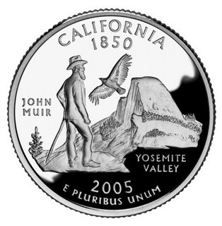
This is a nice transition into my main topic, as of course I intended that it should be. :-) As I mentioned above I like the New York design which features both the state outline (a plus when you have an interesting shape--unlike Colorado--look, I love Colorado, but the outline is boring) and the Statue of Liberty. Texas is also quite interesting with the outline of the state and a single star--harkening to its former status as the Lone Star Republic. Massachusetts, Vermont, and Maryland are also great designs. Kentucky doesn't feature my favourite design--but it isn't half bad--horses are a major part of Kentucky's image. It is California's design that I
 truly despise.
Okay, first of all I don't hate people--just sometimes I really dislike some of the things they stand for. I'm all for being good stewards of the Earth, as God calls us to be in the Bible, but the current environmental movement is far, far beyond the pale. I honestly think that many believe animals should have more rights than humans. It isn't even just the ecoterrorists (yes many are real terroists just as much as Jihadists) or envrionuts--even the mainstream movement is far out of line in my mind. Eh, I'd better not go off into that tangent too much more or I'll become even more vitriolic.
Well John Muir was an early enviornmentalist. I simply think that California's history has much, much more to offer to a quarter design than John Muir and Yosemite. Many other things would be more appropriate to California history than this one man.
Elements from t
 he state seal relating to the Gold Rush, or the Grizzley (as on the state flag--the Bear Flag Republic), agriculture, or any number of other things. Heck, every fourth grader in California learns about the California missions set up by Father Junipero Serra--what about putting San Juan Capistrano and its swallows on the coin? I'd go for that--if I couldn't have some sort of design similar to the flag. ;-) Nearly any of the items above would be preferable to the current design--which unfortunately cannot be changed. :(
I guess I'm just bitter since I don't especially love either the design from my home state of California or my current adopted state of Kentucky. *sigh* But I guess you can't win them all...
~Matt
No comments:
Post a Comment